Artshack
Brand & Platform : Design Consultant
O-L-A · 2024
Rebrand, redesign and digital strategy for a community arts organization in Brooklyn. Work spanned a new visual identity, communications system, and a ground-up digital platform with a revamped content architecture and multi-tier transactional infrastructure supporting classes, events and exhibitions. Designed a digital campaign culminating in a live event and online auction that raised $100k in public funds, the organization’s best fundraiser to date.
A DIY Identity
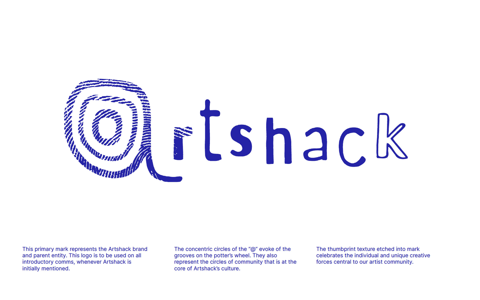
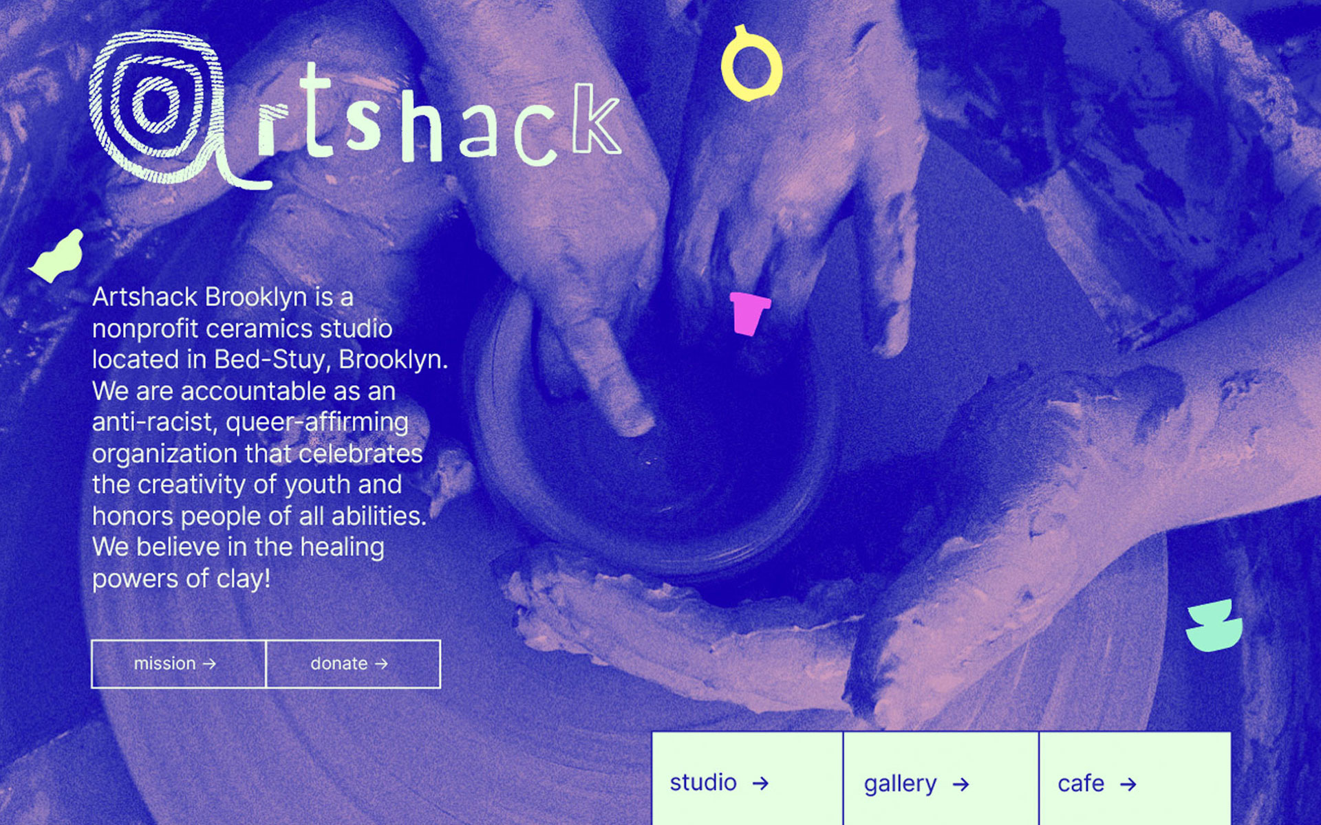
A mark rooted in the human hand, material process, and DIY culture. The concentric rings of the “@" doubling as the whorls of a thumbprint and the grooves of a potter’s wheel.